Matplotlib - 数据可视化基础
官方文档:Matplotlib Docs | Pyplot Tutorial
一、简介
Matplotlib 是 Python 最基础、最经典的 2D 绘图库,几乎所有数据可视化库(Seaborn、Pandas 的 .plot())底层都在调用它。它的目标是让绘图这件事既能"一行代码画个图"应付快速探索,也能"逐个像素调整"做出发表级图表。
一句话:NumPy 是算数据的,Pandas 是理数据的,Matplotlib 是把数据画出来的。
1.1 安装与导入
约定俗成把 matplotlib.pyplot 起别名 plt,几乎所有教程和代码都这么写。
1.2 中文与负号显示
Matplotlib 默认字体不支持中文,中文会显示成方框;同时启用中文字体后,坐标轴的负号也会显示异常。开头统一加两行即可:
plt.rcParams['font.sans-serif'] = ['SimHei'] # 用黑体显示中文
plt.rcParams['axes.unicode_minus'] = False # 正常显示负号
字体按系统换
Windows 用 SimHei(黑体)或 Microsoft YaHei(微软雅黑);macOS 用 Arial Unicode MS 或 PingFang SC;Linux 需要自己安装中文字体(如 WenQuanYi Zen Hei)。
二、核心概念 ⭐⭐⭐
要把 Matplotlib 用明白,最关键的不是记 API,而是先建立三层结构的心智模型:Figure → Axes → Axis。三个词长得像但完全不是一回事,很多新手在这里被绕晕。
2.1 三层结构
一张图从外到内分三层:
- Figure(画布):整张图片本身,是最外层的容器。可以理解为一张空白画纸,你在上面能画一张图、也能画多张子图。
- Axes(坐标系 / 子图):一个具体的绘图区域,包含 x 轴、y 轴、标题、图例等。一张 Figure 里可以有多个 Axes(即多个子图)。注意:Axes 不是"轴",是"一个完整的图"——这是最容易搞混的点。
- Axis(坐标轴):具体的 x 轴或 y 轴那一根线,管刻度、标签、范围。
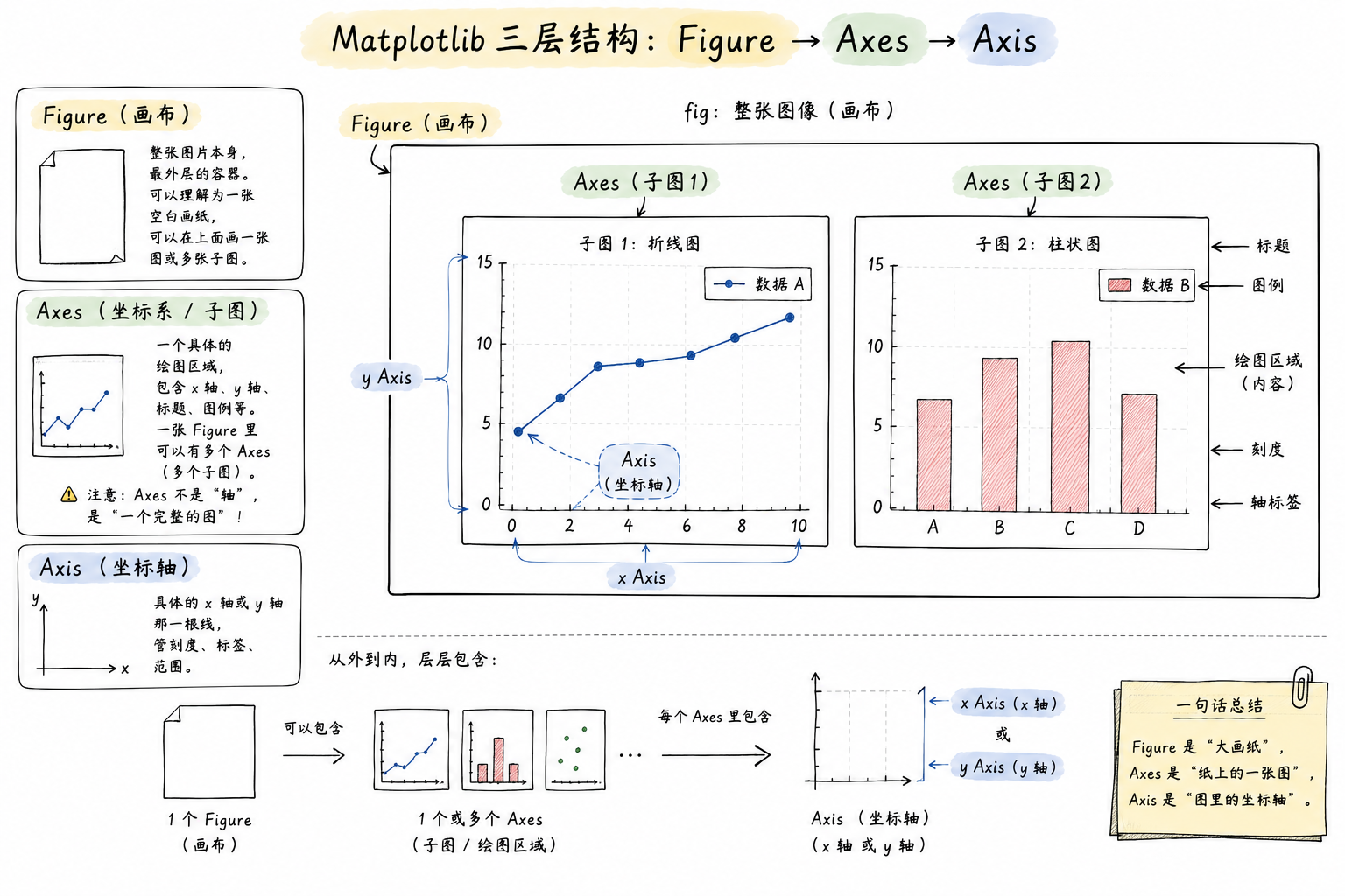
说白了:你在 Figure 这张大画纸上,划分出一个或多个 Axes(每个 Axes 是一张独立的图),每个 Axes 里有 Axis(坐标轴)和你画的曲线/柱子/点。
2.2 两种编程接口 ⭐⭐⭐
Matplotlib 有两套写法,很多教程混着用,导致新手一会儿 plt.xxx 一会儿 ax.xxx,越看越乱。
直接用 plt. 打头,"当前操作总是作用在当前那张图上"。写起来短,适合快速探索。
建议:单图快速看结果用 pyplot,正式代码、多子图统一用面向对象接口。本笔记后面优先用面向对象写法。
| 目的 | pyplot 写法 | 面向对象写法 |
|---|---|---|
| 创建画布 | plt.figure() |
fig, ax = plt.subplots() |
| 设置标题 | plt.title('x') |
ax.set_title('x') |
| 设置 x 轴标签 | plt.xlabel('x') |
ax.set_xlabel('x') |
| 设置轴范围 | plt.xlim(0, 10) |
ax.set_xlim(0, 10) |
| 显示图例 | plt.legend() |
ax.legend() |
规律:plt.xxx() 对应 ax.set_xxx() 或 ax.xxx()。
三、基础绘图 ⭐⭐⭐
3.1 折线图 plot
最常用,画连续变化趋势。
x = np.linspace(0, 2 * np.pi, 100)
y = np.sin(x)
fig, ax = plt.subplots()
ax.plot(x, y)
ax.set_title('sin(x)')
plt.show()
一图多线 + 常用参数:
fig, ax = plt.subplots()
ax.plot(x, np.sin(x), color='red', linestyle='-', linewidth=2, label='sin')
ax.plot(x, np.cos(x), color='blue', linestyle='--', linewidth=2, label='cos')
ax.legend() # 显示图例(必须先指定 label 才有内容)
plt.show()
常用参数速查:
| 参数 | 简写 | 说明 | 常用取值 |
|---|---|---|---|
color |
c |
线条颜色 | 'red'、'#FF0000'、'r' |
linestyle |
ls |
线型 | '-' 实线、'--' 虚线、':' 点线、'-.' 点划线 |
linewidth |
lw |
线宽 | 数字,默认 1.5 |
marker |
— | 数据点标记 | 'o' 圆点、's' 方块、'^' 三角、'*' 星号 |
label |
— | 图例文本 | 字符串,配合 ax.legend() 使用 |
alpha |
— | 透明度 | 0-1,0 全透明 1 不透明 |
格式字符串简写
ax.plot(x, y, 'r--o') 等价于 color='red', linestyle='--', marker='o'。字符顺序不限,颜色+线型+标记的组合。
3.2 散点图 scatter
看两个变量的分布关系。
x = np.random.randn(200)
y = np.random.randn(200)
fig, ax = plt.subplots()
ax.scatter(x, y, s=30, c='steelblue', alpha=0.6, edgecolors='white')
ax.set_title('随机散点')
plt.show()
s:点的大小(可传数组,让每个点大小不同)c:颜色(可传数组,配合cmap做颜色映射)alpha:透明度,点多时开小一点避免糊成一团
3.3 柱状图 bar / barh
看分类数据的数值对比。
categories = ['苹果', '香蕉', '橘子', '葡萄']
values = [23, 45, 17, 35]
fig, ax = plt.subplots()
ax.bar(categories, values, color=['#e74c3c', '#f1c40f', '#e67e22', '#8e44ad'])
ax.set_ylabel('销量')
ax.set_title('水果销量')
plt.show()
ax.bar()垂直柱状图ax.barh()水平柱状图(类目多、名字长时更好看)
3.4 直方图 hist
看一组数据的分布——注意和柱状图区分:柱状图是分类对比,直方图是数值分箱。
data = np.random.randn(1000)
fig, ax = plt.subplots()
ax.hist(data, bins=30, color='steelblue', edgecolor='white')
ax.set_title('标准正态分布')
plt.show()
bins:分几个桶,越大越细density=True:y 轴从"频数"变成"频率密度"
3.5 饼图 pie
饼图用得少(数据一多就没法看),常用于展示占比结构。
sizes = [30, 25, 20, 15, 10]
labels = ['A', 'B', 'C', 'D', 'E']
fig, ax = plt.subplots()
ax.pie(sizes, labels=labels, autopct='%1.1f%%', startangle=90)
ax.axis('equal') # 让饼图是正圆
plt.show()
autopct='%1.1f%%'显示百分比startangle从哪个角度开始画(90 表示 12 点方向)
四、图形定制
4.1 标题、标签、图例
fig, ax = plt.subplots()
ax.plot(x, y, label='sin(x)')
ax.set_title('三角函数', fontsize=14, fontweight='bold')
ax.set_xlabel('弧度', fontsize=12)
ax.set_ylabel('值', fontsize=12)
ax.legend(loc='upper right') # loc 控制图例位置
legend 的 loc 常用值:'best'(自动)、'upper right'、'lower left'、'center' 等。
4.2 坐标轴范围与刻度
ax.set_xlim(0, 10) # x 轴范围
ax.set_ylim(-1.5, 1.5) # y 轴范围
ax.set_xticks([0, 2, 4, 6, 8]) # 手动指定刻度位置
ax.set_xticklabels(['零', '二', '四', '六', '八']) # 手动指定刻度文本
ax.tick_params(axis='x', rotation=45) # x 轴刻度旋转 45 度
4.3 网格与背景
4.4 添加文本与注释
ax.text(0.5, 0.9, '这是文本', transform=ax.transAxes) # 相对坐标 (0-1)
ax.annotate('最大值',
xy=(np.pi/2, 1), # 指向哪个点
xytext=(np.pi/2 + 1, 1.2), # 文字放哪
arrowprops=dict(arrowstyle='->'))
transform=ax.transAxes 用的是"相对子图"的坐标(左下 0,0,右上 1,1),不受数据范围影响,放标题、水印很方便。
五、子图 ⭐⭐
一张 Figure 里放多个 Axes,是 Matplotlib 的常规操作。
5.1 subplots 快速创建网格
plt.subplots(nrows, ncols) 一次创建 m×n 个子图,返回 Figure 和 Axes 数组。
fig, axes = plt.subplots(2, 2, figsize=(10, 8))
# axes 是 2x2 的 ndarray
axes[0, 0].plot(x, np.sin(x))
axes[0, 0].set_title('sin')
axes[0, 1].plot(x, np.cos(x))
axes[0, 1].set_title('cos')
axes[1, 0].scatter(np.random.randn(50), np.random.randn(50))
axes[1, 0].set_title('散点')
axes[1, 1].hist(np.random.randn(1000), bins=30)
axes[1, 1].set_title('直方图')
fig.tight_layout() # 自动调整子图间距,避免标题重叠
plt.show()
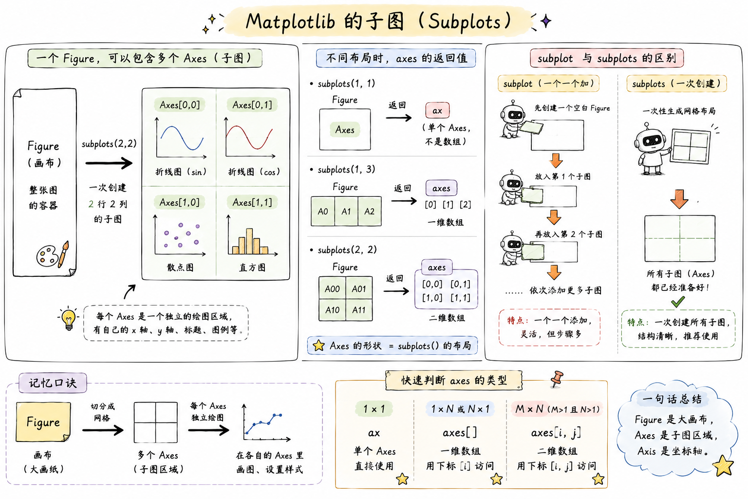
只有一行/一列时
plt.subplots(1, 3)返回的axes是一维数组,用axes[0]、axes[1]、axes[2]plt.subplots(2, 3)返回二维数组,用axes[0, 0]这种下标plt.subplots(1, 1)返回单个 Axes(不是数组),直接ax.xxx
5.2 subplot(pyplot 风格)
单个添加子图,编号从 1 开始:
plt.figure(figsize=(10, 4))
plt.subplot(1, 2, 1) # 1 行 2 列的第 1 个
plt.plot(x, np.sin(x))
plt.title('sin')
plt.subplot(1, 2, 2) # 1 行 2 列的第 2 个
plt.plot(x, np.cos(x))
plt.title('cos')
plt.tight_layout()
plt.show()
plt.subplot(121) 是 plt.subplot(1, 2, 1) 的简写。
六、保存与显示
6.1 保存图片
dpi:分辨率,屏幕看 100 够用,打印/PPT 建议 300bbox_inches='tight':自动裁掉白边(强烈建议加上,不然图周围留一大圈空白)- 支持后缀:
.png、.jpg、.pdf、.svg(矢量图,放大不糊)
先 savefig 再 show
plt.show() 在某些后端下会清空当前图,之后再 savefig 就是空白。稳妥的顺序:先 savefig 再 show。
6.2 显示
在 Jupyter Notebook 里不需要调用 plt.show(),图会自动嵌在单元格下方(前提是加了 %matplotlib inline,新版 Jupyter 默认已开启)。
七、和 Pandas 联动
Pandas 的 DataFrame / Series 有 .plot() 方法,底层就是调 Matplotlib,日常探索性分析用它一句就够了:
import pandas as pd
df = pd.DataFrame({
'A': np.random.randn(100).cumsum(),
'B': np.random.randn(100).cumsum()
})
df.plot(figsize=(8, 4), title='累积和')
plt.show()
df.plot(kind='bar')柱状图df.plot(kind='hist')直方图df.plot(kind='scatter', x='A', y='B')散点图df['A'].plot.box()箱线图
想进一步定制,可以拿到 ax 再改:
八、常用速查
颜色的几种写法
常用 marker 一览
| marker | 形状 | marker | 形状 |
|---|---|---|---|
'.' |
小点 | 'o' |
圆圈 |
'v' |
下三角 | '^' |
上三角 |
's' |
正方形 | 'D' |
菱形 |
'*' |
星形 | '+' |
加号 |
'x' |
叉号 | 'p' |
五边形 |
内置样式表
Matplotlib 自带几种预设风格,一行切换:
九、一个完整例子
把上面的概念串一下:
import matplotlib.pyplot as plt
import numpy as np
plt.rcParams['font.sans-serif'] = ['SimHei']
plt.rcParams['axes.unicode_minus'] = False
x = np.linspace(0, 2 * np.pi, 100)
fig, axes = plt.subplots(1, 2, figsize=(12, 4))
# 左图:折线
axes[0].plot(x, np.sin(x), 'r-', label='sin', linewidth=2)
axes[0].plot(x, np.cos(x), 'b--', label='cos', linewidth=2)
axes[0].set_title('三角函数')
axes[0].set_xlabel('x')
axes[0].set_ylabel('y')
axes[0].legend()
axes[0].grid(True, alpha=0.3)
# 右图:直方图
data = np.random.randn(1000)
axes[1].hist(data, bins=30, color='steelblue', edgecolor='white')
axes[1].set_title('标准正态分布')
axes[1].set_xlabel('值')
axes[1].set_ylabel('频数')
fig.suptitle('Matplotlib 示例', fontsize=16, fontweight='bold')
fig.tight_layout()
fig.savefig('demo.png', dpi=150, bbox_inches='tight')
plt.show()
到这里,日常数据探索需要的绘图能力基本都齐了。想画更漂亮的图,可以看 Seaborn —— 它是 Matplotlib 的高级封装,默认样式好看很多,但底层还是这套 Figure/Axes 的概念。